Show of hands 🤚… who here cringes a little when you’re out in public and you overhear someone say ‘yeah I seen that yesterday’? (or even worse… ‘seent’ that… CRINGE) You know that little quiver you get under your skin when you hear bad grammar? That’s the exact same feeling designers get when we see these design mistakes out in the wild.
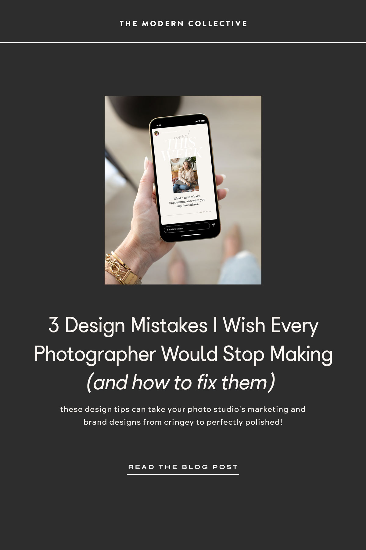
You’re probably thinking, ‘ouch, Adam! A little harsh?’ Maybe, but these tiny design tweaks can take your photo studio’s marketing and brand designs from a little bit cringey to perfectly polished! Don’t come at me! I share these all from a place of love! (and good design)
Design class is in session, photog friends! Let’s jump in!
1. Too Much Space Between Letters When Using A Script Font
Let’s just get this one out of the way! The most cringeworthy design mistake I see photographers making is too much space between letters when using beautiful script fonts! Those fancy scripts are supposed to connect, people!
You may not know this, but Photoshop has an entire character palette dedicated to letter spacing, line spacing, and overall presentation of text. To view the character palette in Photoshop, go to the top MAIN MENU > select WINDOW > and make sure CHARACTER is checked. Within the character palette you will find an option for tracking. It looks like, this: ![]()
With script fonts, the tracking should be set to 0 so those letters are nice and connected. The result is a more realistic script font that looks natural and handwritten as you can see in the example below.

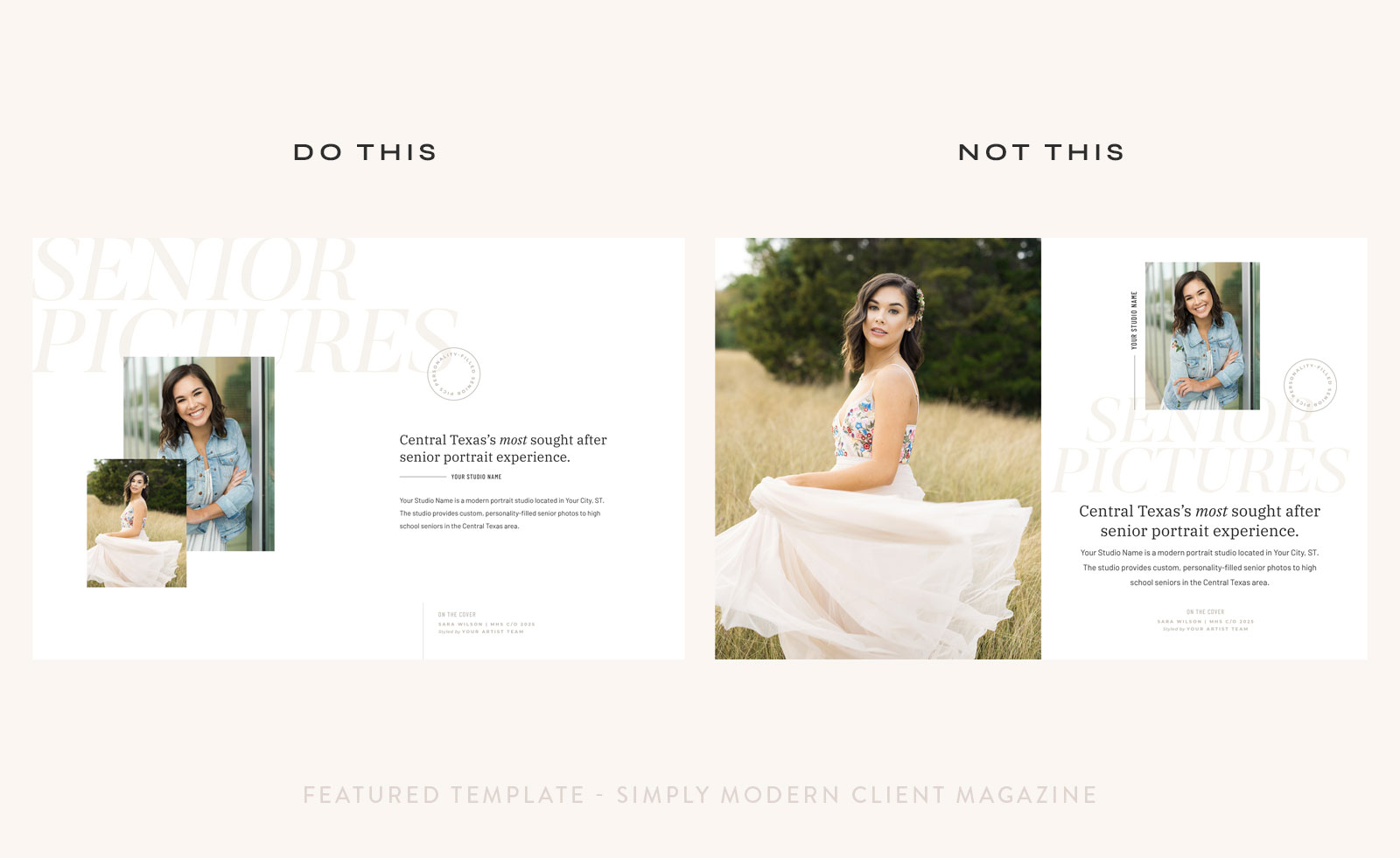
2. Leaving very little room to breathe in your design.
I see photographers doing this ALL the time. They want to fill the design with images or text or design elements and leave little to no space for the design to breathe. White space allows your eye to rest and it gives more weight to the items within the design.
Look at the two client inquiry magazine spreads below. Which do you enjoy looking at more?
Although both are designed using the exact same beautiful images, typefaces, and design elements, the one on the left feels very approachable and easy on the eyes, while the design on the right leaves you feeling a little uncomfortable and overwhelmed.
3. Not keeping things consistent.
You’ve heard the saying – just because you can, doesn’t mean you should. It applies to design, too! It’s exciting to try all of the new things you see on pinterest, and maybe even some of the things you’ve seen other photographers do too, but when you stray too far from your consistent brand elements, it can get confusing for your audience. Keep your fonts, colors, and branding elements consistent throughout each interaction with your clients and audience to maintain brand awareness.
Not sure where to start with consistent design elements? Consider investing in a collection of templates that work together to create a cohesive look. The A-List Shop has numerous done-for-you products that take your client form social media follower, to inquiry response, to session prep, and all the way to final image delivery all with a consistent brand presence. You can easily customize the templates to your brand colors and have a complete collection of designs that make you look more professional than your competition.
There you have it, friends. See I wasn’t that brutal, right? Have a question? Leave it in a comment below or contact me!
Love what you learned? Pin this pin to pinterest or share this post with your photographer friends on social media!